

How Do I Choose Brand Colours That Feel Authentic?
LAST UPDATED: May 2026
“How do I choose brand colours?” is one of the most Googled questions in the branding world.
And honestly? Most of the answers you’ll find are not that helpful.
They’ll tell you that blue means trust, red means urgency, and yellow means happiness. They’ll give you a colour wheel and tell you to pick complementary shades. They’ll point you toward a palette generator and send you on your way.
And then you’ll spend three hours on Pinterest, save 47 different palettes, feel completely overwhelmed, and end up picking something that looks fine but feels like it probably belongs to someone else.
Sound familiar?
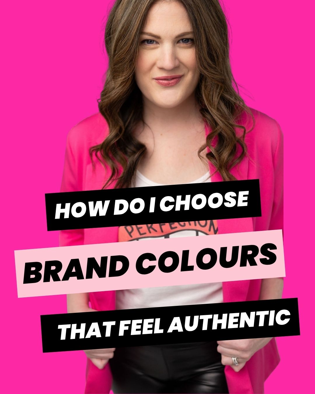
I’m Emily, brand strategist and brand identity designer behind Unbuttoned Brands. I help values-driven service providers build bold, colourful brands rooted in strategy and feel like a natural extension of who they already are.
And one of the most important things I’ve learned? Colour is not where branding starts. But when it’s chosen for the right reasons, it’s one of the most powerful things your brand can include.
If you’re ready to stop guessing and start building a brand that actually feels like you, explore my brand identity services here.
First, Let’s Talk About Why Colour Psychology Isn’t the Whole Answer
You’ve probably heard the rules.
Blue = trustworthy. Green = natural. Purple = luxurious. Red = bold and urgent. Pink = feminine. Ugh!
Here’s the thing…there’s some truth in colour psychology. Colours do carry cultural associations and can evoke certain feelings. That’s real.
But here’s what the rules leave out:
Context matters more than the colour itself.
| Colour | Traditional Meaning (Theory) | Contextual Meaning (Strategy) |
| Red | Danger, Urgency, Hunger | Power, Audacity, “Unapologetic Energy” |
| Blue | Corporate, Trust, Calm | Depth, Reliability without the “Stiff Suit” |
| Pink | Soft, Feminine, Girly | Disruptive, Playful, High-Octane Action |
| Green | Money, Nature, Growth | Grounded, Rebellious, Fresh Perspectives |
A dusty sage green on a wellness brand reads very differently than a neon green on a bold, disruptive coaching brand. Hot pink on one website feels playful and confident; on another it feels mismatched and chaotic. The same colour can mean completely different things depending on everything else around it…your typography, your imagery, your voice, your values.
The rules also assume that everyone in your industry should feel the same way to potential clients. But if you’re building a brand that’s different — that disrupts, that challenges norms, that refuses to fit the standard mold — then following everyone else’s colour rules is literally working against you.
According to a study on the Impact of Color on Marketing, researchers found that up to 90% of snap judgments made about products can be based on colour alone — but those judgments depend entirely on the appropriateness of the colour for the brand’s specific personality.
The goal isn’t to pick colours that mean the right thing in theory. It’s to pick colours that feel true to you and that communicate the right energy to your specific people.
That’s a very different thing!
What are the most common mistakes when choosing brand colours?
Before we get into how to do this well, let’s look at the most common mistakes…because chances are you’ve made at least one of them. (Me too. No judgment. I’ve seen it a thousand times.)
Choosing colours based on what’s trending
Sage green and warm beige had a very long run. So did that particular shade of dusty rose. And they’re beautiful! But if you chose them because they were everywhere, your brand looks like everyone else’s brand, and that’s a problem when you’re trying to stand out!
Trends have a shelf life. Your brand should not.
Choosing colours based on what you think your audience wants
“My clients are professional women so I should probably keep it neutral and clean.”
Maybe. Or maybe your ideal client is exhausted by neutral and clean and is desperately looking for someone who has the courage to show up with some actual personality.
Making assumptions about what your audience wants, rather than getting clear on who you actually want to attract and what you actually want to express, leads to a brand that appeals to no one in particular.
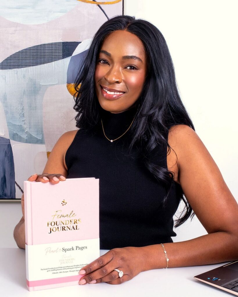
When I did the branding for Pearl Spark Pages, my client Lisa was torn between two mood board directions I had created. Initially, she went with the cool palette because her brain told her it’s what people “expect” from a luxury brand. But when her physical journal samples actually arrived from the printer, the gold accents just hit different…they looked more premium and, more importantly, she actually loved them! We made a last-minute pivot to the warmer palette because she realized she’d been choosing based on what she thought her audience would want, instead of herself. Within months, her new brand helped her do the work of raising $11,000 through crowdfunding (40% of her entire launch budget) and a feature in the #1 subscription box for female founders.
Choosing colours before you’ve done the strategy
This is the big one.
Colour is an expression of your brand strategy. It should come after you’ve gotten clear on your values, your personality, your differentiators, and your ideal client…definitely not before.
When you pick colours without that foundation, you’re essentially decorating a cake that hasn’t been baked yet. It might look okay from the outside, but then it all just kind of turns to mush.
How to Actually Choose Brand Colours That Feel Authentic
Okay, here’s the part you actually came for.
This is the process I use with my clients…and the reason their brands end up feeling so distinctly, unmistakably them.
Step 1: Start with feeling, not aesthetics
Before you open a colour picker or scroll Pinterest, I want you to ask yourself a different set of questions:
- How do you want someone to feel when they land on your website for the first time?
- What feeling do you want associated with your brand before a person has read a single word?
- If your brand were a physical space what would it feel, look, and smell like?
- What feeling do you absolutely not want your brand to have?
These questions bypass the “what looks nice” trap and get you into emotional territory, which is exactly where good branding lives.
When I ask my clients these questions, the answers are always rich and specific. “Warm but not cozy. Bold but not aggressive. Like walking into a space that makes you feel like you can breathe and take up room at the same time.” That kind of answer? That’s a colour direction.
By defining the emotional “vibe.” you create a filter that makes it easy to say “no” to colours that look pretty but feel wrong.
Step 2: Look at what you’re already drawn to
This one sounds simple. It’s more powerful than it seems.
Look at your wardrobe. Your home. The art you’ve saved. The brands you love. The books on your shelf. Your favourite places.
You have a colour story already…a palette of shades that show up again and again in the things you choose when nobody is telling you what to pick. That’s not a coincidence. That’s a genuine aesthetic sensibility, and it belongs in your brand.
When your brand colours reflect what you’re actually drawn to, showing up in your brand stops feeling like a performance. You feel excited about it. It feels home-y to you! And that ease is visible to the people who encounter your brand.
Step 3: Filter through your values and personality
Now that you have some feeling-based direction, it’s time to cross-reference with your brand strategy.
Your values and personality traits should have colour equivalents. Not in a rigid, textbook-psychology way, but intuitively (at least that’s how I work).
Ask yourself:
- Do these colours feel confident? Warm? Playful? Bold? Grounded?
- Do they feel consistent with the personality I want my brand to have?
- Do they feel like permission…for me and for my ideal client to be exactly who they are?
If your brand is anti-hustle, warm, and deeply human, a cold, corporate blue-grey palette probably isn’t going to land right. If your brand is bold, disruptive, and a little bit sassy, a muted, minimal palette might make you feel invisible.
Your colours should feel like an extension of your personality, not a costume you put on.
Step 4: Consider your industry context (and decide whether to follow or break the rules)
Here’s where a little competitive awareness actually helps.
Look at the brands in your industry. What colours dominate? What’s the visual landscape look like?
Now decide: do you want to fit in or stand out?
Sometimes fitting in has strategic value…if your audience has strong associations between certain colours and your type of service, working within that palette (with your own distinctive spin) can feel right.
But often, especially for the values-driven, disruptive, entrepreneurs I work with…the most powerful move is to deliberately not look like everyone else.
Bold, colourful branding in an industry full of beige is a statement. It says: I’m not trying to blend in. I know who I am. And I’m not making myself smaller to be more palatable.
That’s a brand that gets noticed.
What Authentic Brand Colours Actually Do for Your Business
Choosing colours that are genuinely aligned with who you are isn’t just a feel-good exercise. It has real, practical impact on your brand’s performance.
It builds instant recognition. A consistent, distinctive colour palette is one of the fastest ways for people to recognize your brand across platforms. When your colours are bold and specific enough to be yours, you become visually memorable.
It attracts the right people. Your ideal client is drawn to certain aesthetics. When your palette reflects your actual energy, it acts as a filter…pulling in the people who vibe with how you work and gently repelling the ones who don’t.
It makes showing up easier. When your brand colours feel like you, you stop second-guessing your visuals. You stop tweaking endlessly. You show up with more confidence because you feel at home in your own brand.
It communicates before you speak. Someone lands on your website before they’ve read a word. Your colours are already telling them something about who you are and whether you’re for them. Make sure what you’re saying is true.
FAQs About Brand Colours
What colours are best for branding?
There isn’t one “best” colour for branding. The right colour palette depends on your industry, your audience, your brand vibe and personality. The key is choosing colours that feel authentic to your brand rather than blindly following trends.
How many brand colours should I have?
Most brands work best with a core palette of 3–5 colours. Too many colours can make your branding feel inconsistent or overwhelming. The goal isn’t to use every colour you love…it’s to create a palette that feels cohesive, recognizable, and easy to use across your website, social media, and marketing materials.
Can I use bold colours in a professional brand?
Absolutely. Professional doesn’t have to mean beige, boring, or muted. Bold branding can actually help you stand out and become more memorable — especially in crowded industries. The important thing is using colour intentionally and consistently.
Do brand colours really matter?
Yes. Your brand colours influence first impressions, recognition, and emotional connection. Consistent brand colours can help your business feel more trustworthy, memorable, and cohesive across platforms. They’re not just decorative — they’re part of how people experience your brand.
Should I follow colour psychology when choosing brand colours?
Colour psychology can be helpful, but it shouldn’t be treated like a rigid formula. Context, culture, audience, and personal expression matter too. A colour doesn’t automatically mean one thing for every brand. The most effective palettes combine strategy with intuition and alignment.
You Don’t Have to Figure This Out Alone
Here’s the honest truth about choosing brand colours: the process I just described is genuinely hard to do for yourself.
Not because you’re not capable…you absolutely are. But because you’re too close to your own work to see it clearly. The same way you can’t read the label from inside the jar.
That’s what a brand strategist is for.
Before I choose a single colour for a client, we go deep on strategy: values, voice, personality, differentiators, ideal client, visual direction. The colours emerge from that work. They’re never arbitrary. They always feel true.
The result is a brand that looks like you, sounds like you, and works hard for you—so you can stop hiding and start showing up.
If you’re ready to build a brand identity that’s genuinely, unmistakably yours, let’s talk about working together.
xo Emily
If this gave you something to think about…you’ll probably love my bi-weekly emails! Join hundreds of entrepreneurs who are building bold, values-driven brands just like you.

Emily Lauren Dick is an author, feminist, brand strategist, and designer and the founder of Unbuttoned Brands, a bold brand studio for entrepreneurs who want to make money and make the world a better place. She helps values-driven businesses look as good as the impact they're making, building brands that feel unmistakably them because Being Yourself is the Strategy™.


